they quit because it didn’t make sense. because the flow had a dead end. because the thing they came to do took nine steps instead of two. that’s a thinking problem, not a visual one.
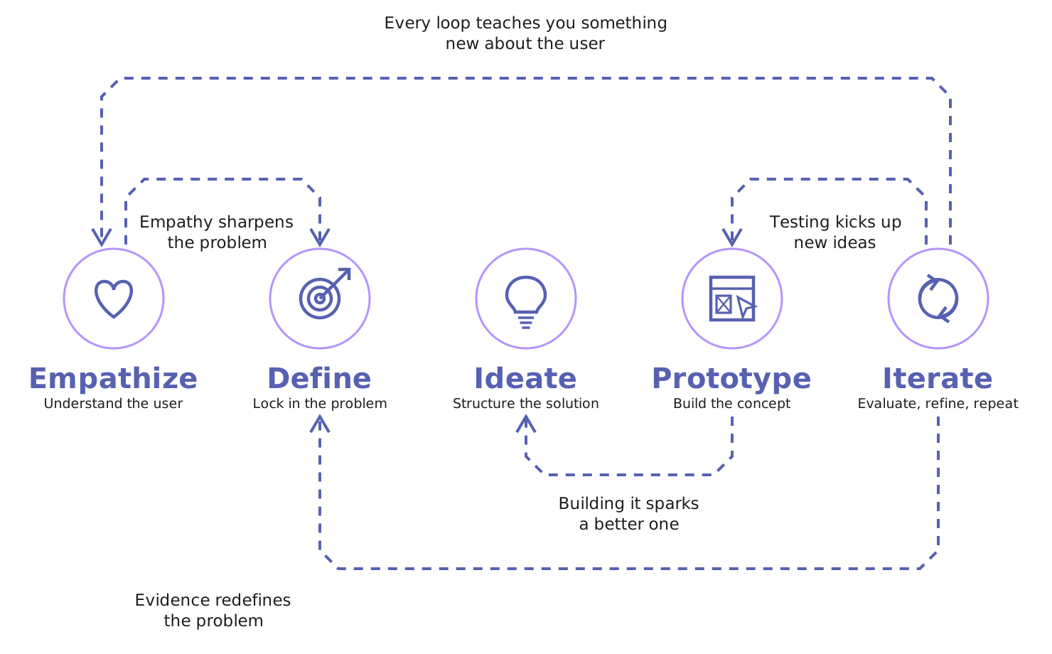
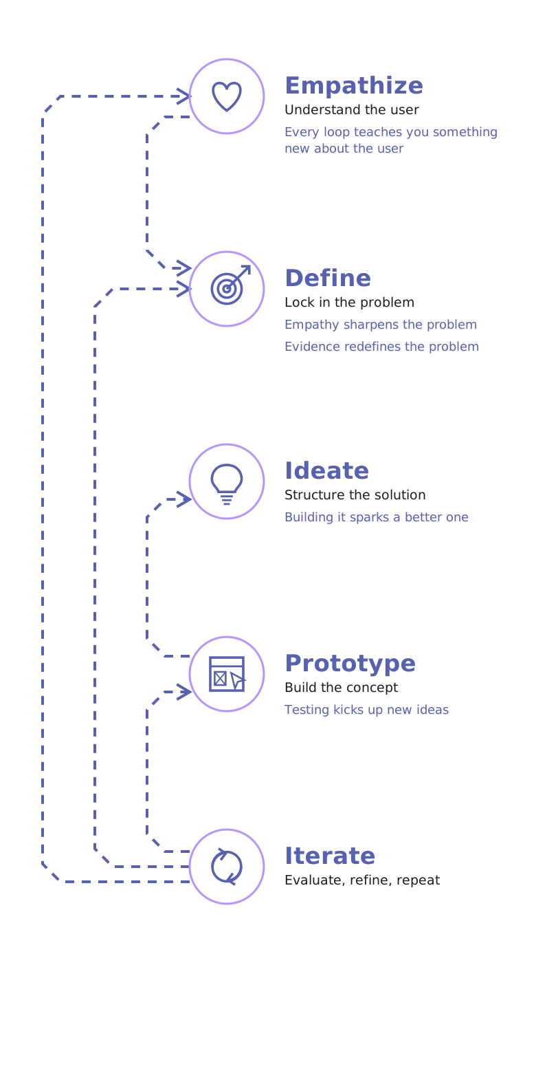
here’s how I work through it — five phases, real documents at every one, and actual work from real projects so you can see it’s not just a diagram on a website.
Real talk about how this usually goes.
most people come to me with a solution already decided. “we need a dashboard.” “we need an onboarding wizard.” and sometimes that’s right.
but a good chunk of the time, the thing they described isn’t the thing that fixes the problem they’re actually having. and the only way to find that out is to slow down for about two weeks at the start.
two weeks of thinking is cheap. three months of building the wrong thing is not.
so the process below isn’t ceremony. every phase exists because it catches a specific, expensive mistake — and every phase hands you a document you can take to your board, your devs, or your investors.
01
Empathize
Understand the user — the real one, not the imaginary one.
What actually happens: I talk to the people who’ll use the thing, and the people who own the thing — separately, because they never say the same stuff. I dig into your support tickets, your analytics, your churn reasons if you have them. anything that shows me behavior instead of opinion.
then I build personas that are useful — not the stock-photo kind with a fake name and a favorite coffee. the kind that says “this person opens your app on a phone, one-handed, at 11pm, already annoyed.” that’s a design constraint. “Sarah, 34, loves yoga” is not.
empathy maps come out of the same pass: what they say, think, do, and feel. the gap between what people say and what they do is usually where the whole project lives.
What you get
User Personas
Empathy Maps
Research Synthesis Summary
What it prevents
the “we assumed users would just…” conversation, six months and a full sprint budget in.
raw interview quotes clustered into themes worth designing around.
02
Define
Lock in the problem before anyone falls in love with a solution.
What actually happens: I write one sentence. it takes days. it’s the problem statement, and if we can’t agree on it, there’s no point designing anything yet.
then the journey map — every step someone takes to get the job done, including the parts that happen outside your product. email. a phone call. a spreadsheet they keep on the side because your tool doesn’t do the thing. the emotional line across that journey is where you find the drop-offs, and drop-offs are money.
we also agree on what success looks like numerically, right here. “better UX” isn’t a goal. “task completion goes from 40% to 75%” is a goal. one of those you can prove.
What you get
Problem Statement
User Journey Maps
Success Metrics & KPIs
What it prevents
building a beautiful, well-tested, perfectly engineered answer to the wrong question.
the numbers we’re moving, baselined before we touch anything.
03
Ideate
Structure the solution — architecture before aesthetics.
What actually happens: information architecture first. what lives where, what’s nested under what, what someone should be able to reach in one tap versus four. get this wrong and no amount of pretty UI saves it — people just can’t find things.
then user flows. every path, every branch, every decision point, and — the part most people skip — every failure state. what happens when the payment declines. when the file’s too big. when they’ve got zero data on the dashboard. that’s not edge-case stuff, that’s most of your real usage.
this is also where I kill features. out loud, on the record, with a reason. the roadmap gets shorter and the product gets better, which is an annoyingly consistent pattern.
What you get
Information Architecture
User Flow Diagrams
Task Models
What it prevents
devs inventing structure on the fly, then rebuilding it twice when the real logic shows up.
core jobs mapped to the shortest honest path through the product.
04
Prototype
Build the concept — real enough to argue about.
What actually happens: low-fidelity wireframes first, deliberately ugly. grey boxes. no color, no brand, no typography opinions. because the second something looks finished, people stop critiquing the structure and start critiquing the button color.
once the structure holds up, it goes clickable. a real prototype you can hand to a real person and say “book a room” and then shut up and watch. no explaining. no guiding. that silence tells you more than a hundred stakeholder meetings.
and because I also write code, the specs I hand off are specs a developer can actually build from — states, spacing logic, breakpoints, behavior. not a pretty picture with a “figure it out” attached.
What you get
Lo-fi Wireframes
Interactive Prototype
Component & State Specs
What it prevents
discovering the flow is broken after it’s been coded, QA’d, and demoed to the CEO.
written by someone who’s had to build from bad specs.
05
Iterate
Evaluate, refine, repeat — until the evidence says stop.
What actually happens: five to eight people, real tasks, no coaching. I watch where they hesitate, where they backtrack, where they say “wait, what?” — and I time it. hesitation is data.
the report that comes out ranks issues by severity and effort, so you know what to fix this week versus what goes on the someday list. it also tells you what’s working, which matters — plenty of teams accidentally redesign the one part users loved.
then we go again on whatever failed. this loop is the whole difference between a product people tolerate and one they tell their coworkers about.
What you get
Usability Testing Report
Severity-Ranked Issue List
UX Recommendations
What it prevents
shipping on vibes, then finding out from a one-star review what you got wrong.
That’s usually a thinking problem. Tell me what’s going on I’ll tell you straight whether it’s a UX fix, a product fix, or something else entirely. No pitch deck.