Designing a high-end digital presence for an investment brand
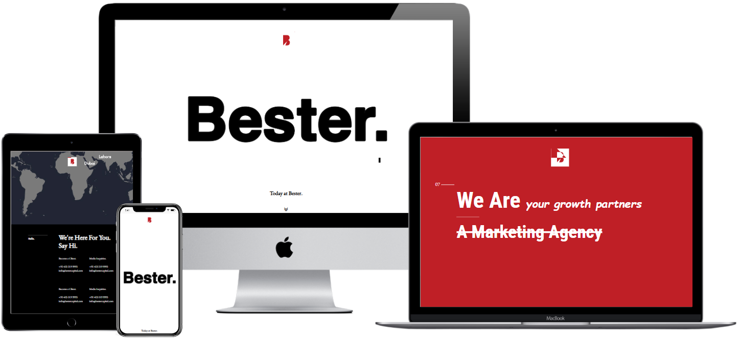
Bester Capital was designed as a high-impact digital presence for a premium investment entity, associated with high-profile leadership. The goal was not just to inform — but to project authority, trust, and exclusivity.
Built to project authority, trust, and exclusivity — not just information.
The Challenge
Most investment websites fall into two extremes:
Overloaded platforms → too much data, low clarity
Generic corporate sites → no personality, no impact
For Bester Capital, the challenge was to:
Create a strong first impression for high-value clients
Avoid overwhelming users with unnecessary content
Maintain a luxury feel without complexity
The Objective
The client needed a website that:
Feels elite, powerful, and trustworthy
Appeals to high-net-worth investors
Communicates value without overwhelming content
Looks visually superior to typical finance websites
Unlike traditional financial platforms (which often overload users with data and features ), this project focused on perception-first UX.
This was not about dashboards.
This was about Impression, Positioning, and Confidence.
My Role
I was responsible for shaping both
the user experience strategy and frontend execution
of the project.
This included defining how the brand is perceived digitally, structuring the user journey, and implementing a clean, high-performance interface with full visual control.
Design Approach
Perception First
Instead of prioritizing features, the focus was on how the brand is felt.
Strong visual hierarchy
Minimal content
Clear, confident messaging
Cinematic Layout
The website was designed as a scroll-based experience.
Each section introduces a new layer of the brand
almost like a presentation rather than a traditional website.
Controlled Interaction
Smooth transitions using jQuery
No unnecessary UI elements
Focus on flow instead of clicks
The Outcome
The project demonstrates how design clarity and execution quality can elevate perception without relying on complexity
A strong, premium brand presence
A clean and focused user experience
A visually distinctive alternative to traditional finance websites
WHAT I’D DO TODAY ?
The Project was made in 2017, If evolving this gig today, I would: